Nordstrom Usability
Making it easier for prospective shoppers to search, browse, and filter for apparel, accessories, and beauty.
Brief
Client
HCDE 517:
Usability Studies
Duration
10 weeks
(Winter 2022)
Roles
Usability Testing, Data Analysis
Team: Priyana Patel, Jeff Pabst, Don Lee, Claudia Pang, Kevin Shum
Project Scope
For this project, our team chose to conduct usability testing on the Nordstrom.com desktop core shopping experience. The desktop experience represents a significant portion of Nordstrom’s digital sales and was easier to test remotely via video conferencing software. It's also an important plaform for Nordstrom's most loyal customers.
Product & Focus Area
- Searching or browsing for items
- Navigating product pages
- Using supporting features like filters and sorting
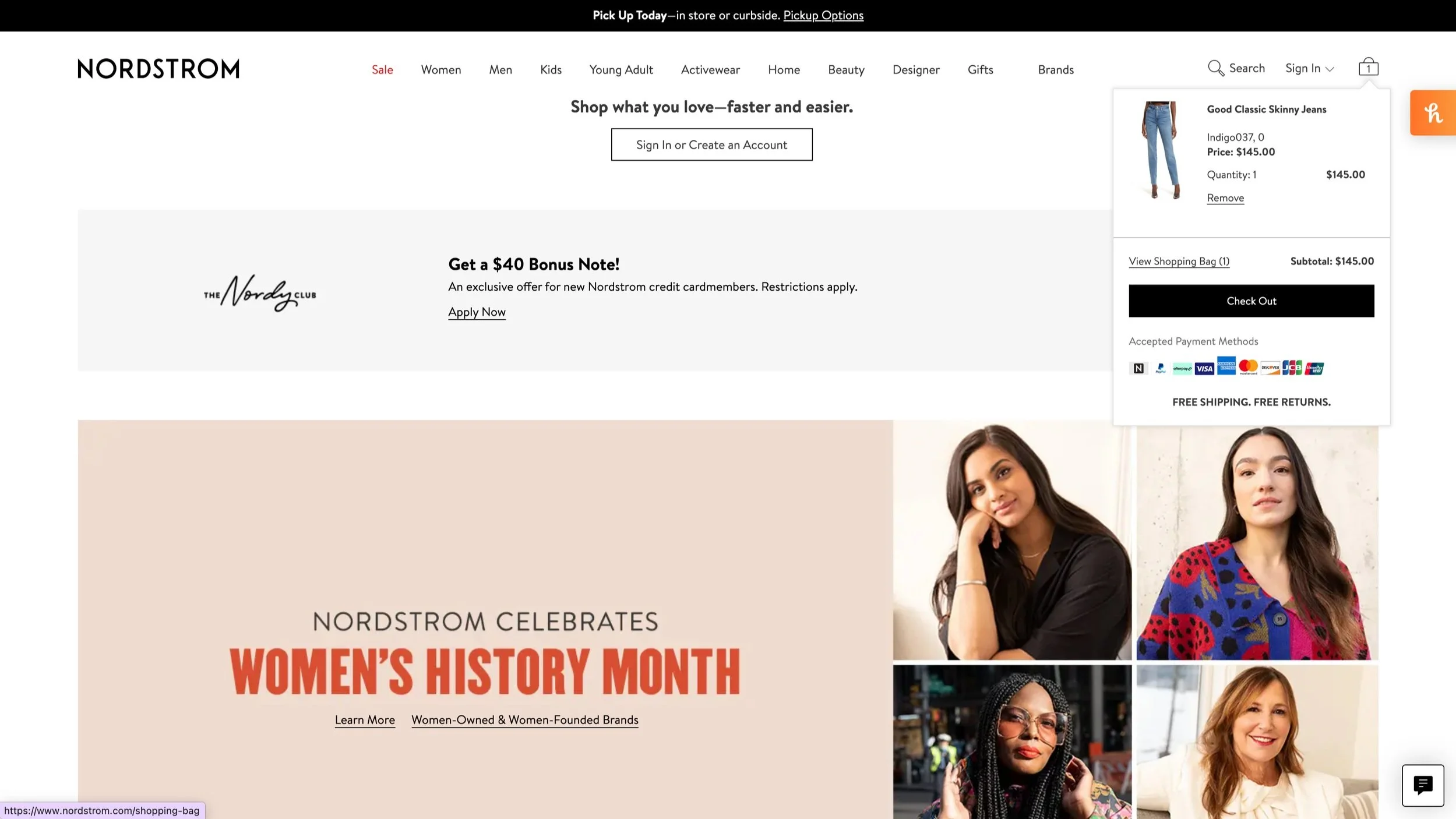
- Managing the shopping bag (cart)
- Initiating the checkout process
Target Users
We determined that the target audience for this testing should be potential Nordstrom customers. Potential Nordstrom customers can be described as people who are familiar with e-commerce shopping and interested in and able to buy the types of products that Nordstrom sells (apparel, accessories, beauty products, home goods and decor, etc.).
Research Goals
Our goal in evaluating the core shopping experience was to strengthen user experience across the site, elevate the Nordstrom brand, and enhance their company’s business. These goals can help the client improve their business goals and internal objectives, such as high customer retention rates, spending, and user satisfaction. The team created the following research questions (RQs) to help guide the design of the study.
-
RQ1: What are the usability issues with the end-to-end shopping journey within the Nordstrom.com desktop experience?
-
RQ2: Are shoppers able to successfully use the browse and search functionality in order to find specific items?
RQ3: In what ways do the filters meet or not meet customers’ needs and expectations when searching for a particular product?
RQ4: How can we increase the efficiency of the browsing experience to help shoppers locate their desired items in the fewest number of clicks and shortest amount of time? Are users able to use quick view to help them find their items more efficiently?
-
RQ5: Are shoppers able to find both basic and detailed product information on the website?
RQ6: Are shoppers able to purchase multiple versions of the same product?
-
RQ7: Are shoppers able to navigate to the checkout screen with their desired items?
RQ8: Are shoppers able to manage their items in the mini and full shopping bags?
Participants
We recruited participants through a screener form which was sent out to team members’ various personal and professional networks. Using the questions included in the screener, participants for this test were required to meet a set of criteria to ensure they were familiar with e-commerce shopping and interested in the types of products that Nordstrom sells. The reason we didn’t select any participants that had used the Nordstrom.com website within the past 6 months was to avoid any regular Nordstrom.com shoppers who may have developed routine workarounds that circumvent underlying usability issues, as well as to avoid bias in the testing or ability to accomplish tasks based on recent experience.
Our participants met the following requirements:
- Purchase products via online retailers at least 2-3 times a year
- Have purchased apparel or beauty products online within the last 6 months
- Have not purchased anything using the Nordstrom.com website within the past 6 months
Survey Data
We had a total of 9 participants (6 female, 3 male) who were between the ages of 18 to 34 years old. We also learned more about shopper's goals when looking for luxury products online as well as their perception of the Nordstrom brand.
Methods
Remote-Moderated Testing
All of the usability testing was done remotely using Zoom video-conferencing software. Each session included 1 moderator and 1-2 notetakers. For the duration of the session, participants were also instructed to use the think-aloud protocol, in which they provide a continuous verbal commentary of their thoughts, emotions, experiences, design recommendations, etc.
Pre-Test and Post-Test
Each participant was given a Pre-Test Questionnaire and Pre-Test Interview to learn about participants’ personal goals and experiences when shopping online, as well as any particular experiences or problems they have encountered when using other online retailer platforms. After all tasks were complete, participants were given a verbal post-test questionnaire to rate their overall experience using the Nordstrom.com website and provide any thoughts or ideas for design recommendations.
Main Test
The test itself included a total of 11 tasks, broken into 4 different scenarios. After each task, the participant was given a post-task questionnaire in which they rated the ease or difficulty of completing that task, and asked to elaborate on why they chose their specific rating.
-
T1: Find designer clothing on sale with 4+ customer rating
T2: Show us how you would find detailed product information
T3: Add the item to your shopping bag
T4: Save item for later
-
T5: Use menu bar to find a pair of black, waterproof boots available in your size.
T6: Add 2 pairs of the boots you found to your shopping bag.
-
T7: Use the search bar to find a green colored top in your size between $50 to $100.
T8: Add a different size of the same item to your shopping bag.
-
T9: Remove one pair of black boots from your shopping bag.
T10: Find an item you saved for later
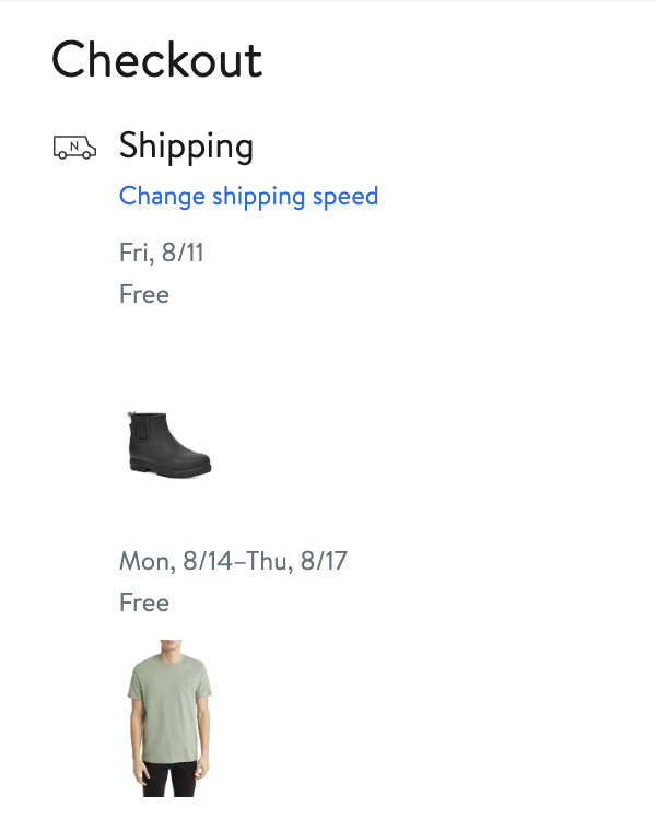
T11: Complete your order
Data Collection
We collected both qualitative and quantitative data to understand user’s thoughts, emotions, and experiences when using the Nordstrom.com website and determine the severity of issues.
Qualitative
Shopping is a very personal and subjective experience, and the qualitative data collected during the study is important to understand the users’ thoughts, emotions, and experience when using the Nordstrom.com website. The primary sources for qualitative data were:
- Think-aloud verbalizations
- Observations from notetakers (1-2 per session)
- Pass/Fail criteria for each task
- Interview responses
- Pre-test and post-test answers
Quantitative
Our quantitative data was important to capture objective measures to help determine the severity of issues and make direct comparisons between tasks or experiences.The primary sources of quantitative data were:
- Likert scale (1-5) to rate the difficulty of each individual task (where 1 is “very easy” and 5 is “very difficult”)
- Likert scale (1-5) to rate the overall experience using the Nordstrom.com website
Findings
Below are the 2 major usability findings that resulted from our sessions, based on the severity, frequency, and scope of the issue. We used the following severity ratings to document the urgency of each usability finding. These were adopted from Nordstrom’s User Experience (UX) team:
Save for later is easy to forget and too deep into the shopping flow
The Save for Later feature relies on browser cookies to archive shopping items and is accessible from the shopping bag. We found that the Save for Later button is easily forgettable and too deep into the shopping flow, specifically because you can only access it from the shopping bag . If a shopper forgets about the products they saved for later, the items may go out of stock causing potential frustration.
Several participants mentioned what they would usually do when they are not ready to make a purchase, including:
- Leaving items in the shopping bag
- Writing down the name of the item
- Pinning the tab
- Taking a picture
“Sometimes, I would just take a screenshot/picture so I remember the items” —P6
“When I’ve shopped on websites before and I put things in the cart, even if I leave it, they stay there” —P3
Recommendation: To help shoppers remember items they saved for later from the homepage, we recommend adding them to the mini shopping bag with a little nudge to ensure they don’t miss out.
Inconsistent product filter behaviors can obstruct the browsing experience
Filters are a key part of the shopping experience and generally matched shoppers' needs…but with some caveats. When selecting multiple inputs (i.e., size, color, brand), the filter bar layout and cursor position inconsistently changes after reloading . This can cause minor delays and frustration during the browsing experience.
For multi-select dropdowns, we expect to easily select and deselect options at ease. The erratic behavior affects our expectations of how multi-select dropdowns usually behave.
“This left menu bar is kind of frustrating in that it reloads and then just kind of shifts so if you're trying to click multiple things quickly, it’s a little bit frustrating – I can't just click, click, click.” —P8
Recommendation: Explore alternative filtering patterns that maintain a consistent layout. Potential options include (as seen on Bloomingdales desktop site):
Remove auto-reload – allow user to control when to apply filters
OR
- Maintain auto-reload – lock user input during the reload
Reflection
Task Structure
More open-ended tasks could have provided better insight into people’s natural shopping habits and how the website supports their personal experience. We chose more prescriptive tasks to evaluate the usability of specific flows and features, however, several participants noted that the guided tasks didn’t necessarily align with how they would naturally go about accomplishing certain shopping goals.
You can view the full usability report here.


